21 Dec Website and Presentation Slides
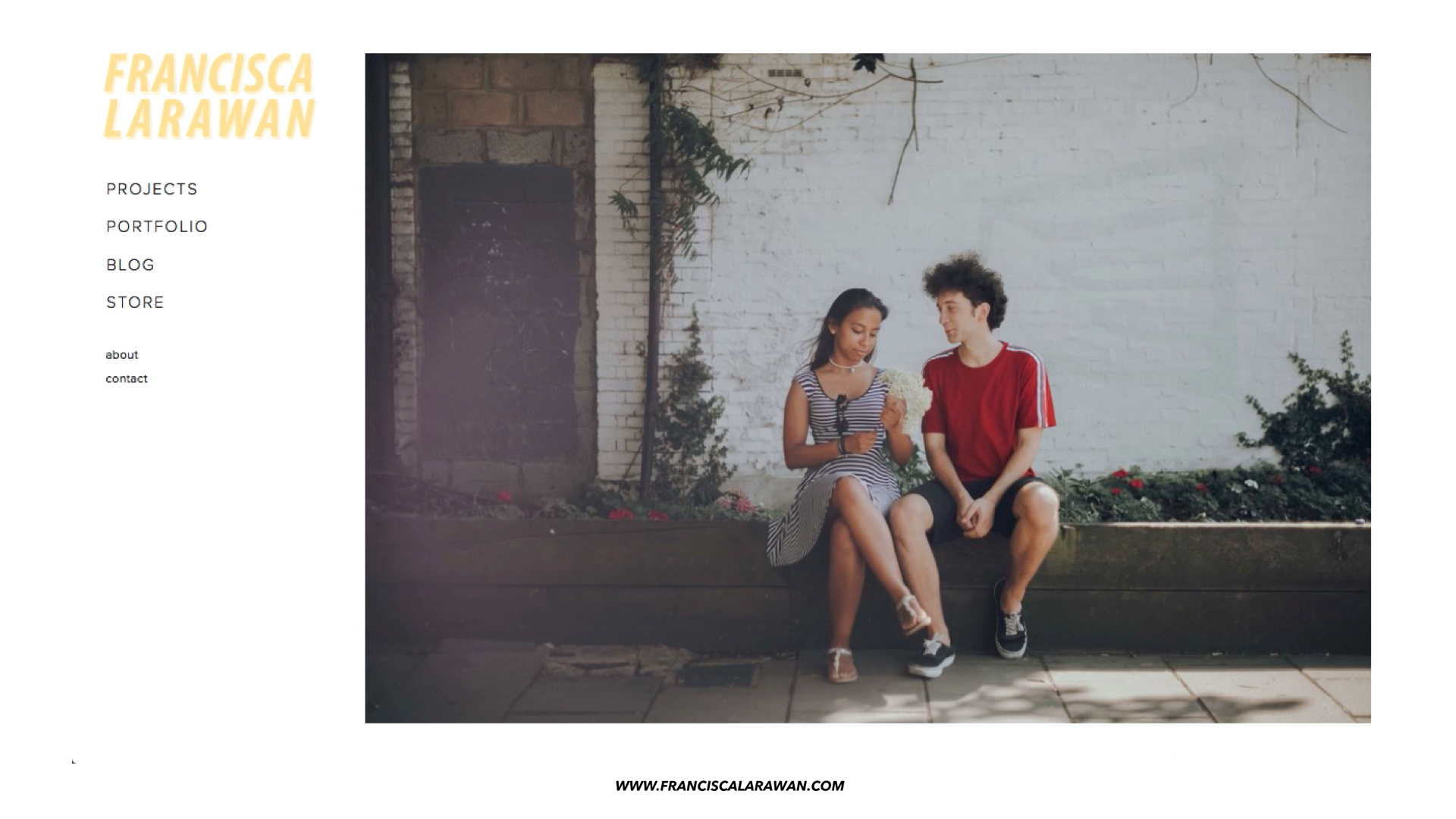
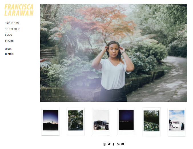
WEBSITE
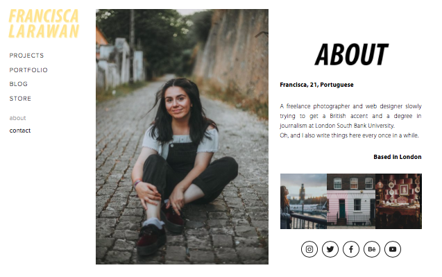
I tried to keep my website as true to myself and my ‘brand’ as possible. Every page has the same font, style, and colour scheme, which I believe resembles my photography and editing style. Additionally, all my social media profiles are clearly spread across my website.
On the front page I have the main menu (and drop down menu under “portfolio”), a slideshow of my most recent work, and some polaroids which give it a personal touch. My inspirations for my layout and web design were a mix between Jessica Whitaker‘s photography website and Conan Gray‘s Merch Store, as they are two artists that I truly admire.
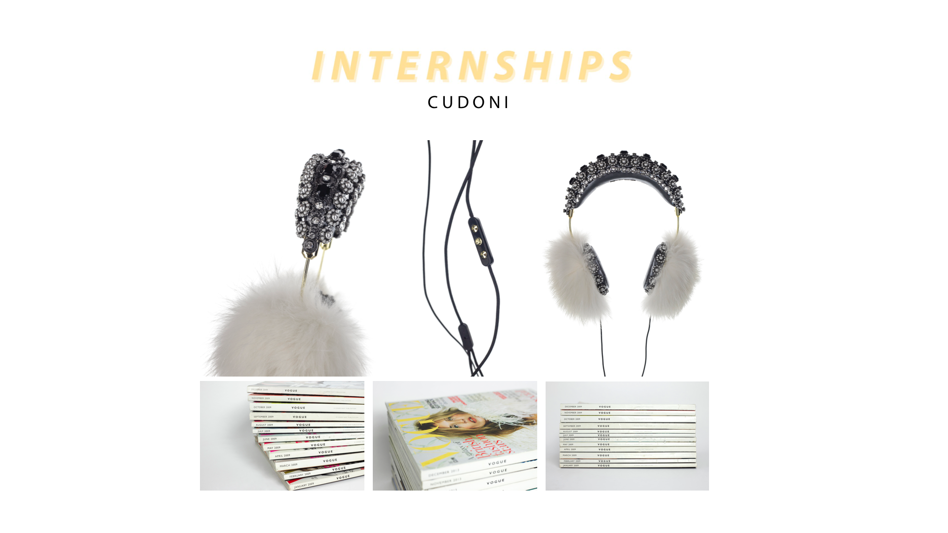
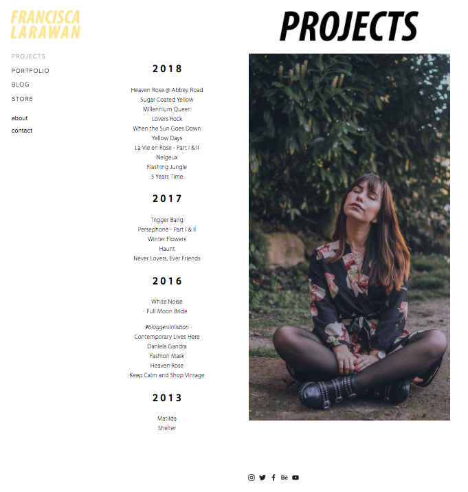
The “Projects” tab showcases all the projects I’ve been working on since 2013. I consider a ‘project’ to be a set of pictures from a shoot with a more editorial style. I use it as an extended gallery to my “Portfolio”.
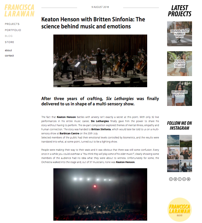
My “Blog” page is where I write about products I’ve been sent, but also the concert reviews that I’m most proud of (which were written for music publications such as Watch and Listen and Side Stage Collective).
I tried to keep my “About” page, once again, slightly more personal. I want future clients to read it and feel like they know me, which will make them feel more comfortable when choosing me to be their photographer. I took inspiration for the writing style from, again, Jessica Whitaker’s own “About” page.
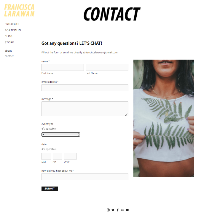
Lastly, the “Contact” page gives people a chance to ask me any questions they might have, or book any type of event they want me to cover (which they can choose from a pre-made list I already have).
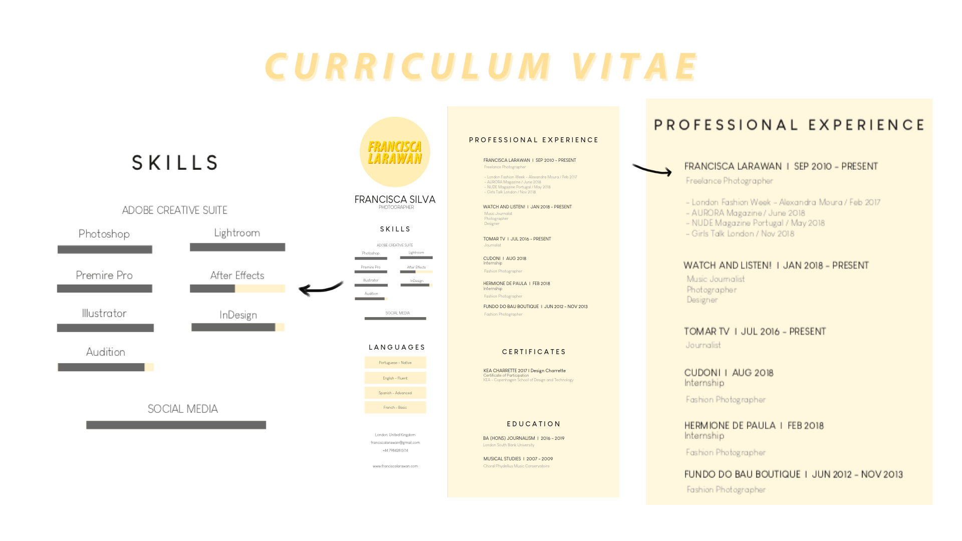
PRESENTATION SLIDES