08 May Workbook
14th April
For my dataset I have chosen The amount of alcohol related deaths in the UK from 1994-2016.
I noticed in the data that the rate for men is always higher than women but when looking for data on the population in the UK I found that there are slightly more women than men in the UK.
16th April
I also noticed that during the year of the 2008 recession the amount of total deaths spiked and I thought that this would be a good idea for a story. However, there isn’t any evidence to prove that is was because of the recession that I have found yet.
So instead of making my article solely about the spike in deaths during the recession, I’m going to find further research to explain why the amount of men dying is so different to the rate of women.
24th April
After looking at the Drinkaware website I found how drinking habits have changed and how that’s impacted deaths. More people are binge drinking which has a huge impact on health and causes more fatalities.
I’ve found so many stats and research points on the Drinkaware website that it is now going to play a huge part in my article.
I’ve found that binge drinking is becoming increasingly popular and it’s way more harmful than than other drinking habits so could be cause of rising deaths.
5th May
After again looking deeper into the data I’ve realised that the total amount of deaths per 100,000 has actually been on a steady decrease. This changes the tone of my article slightly and instead of saying the total number of deaths has increased I’m focusing solely on the increasing difference between men and women. The difference between men and women is on a steady increase too but what’s more interesting is the actual amount between men and women being so big.
So the main focus of my article is focusing on the difference between male and female deaths and looking into why the difference has increased.
Now I can start to focus on my infographic:
This was one of my initial drafts. I decided to work mainly without templates on visme
I chose vista because I liked the icons available and how easy it was to create my own professional infographic.
7th May
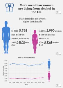
I wanted to visually show the difference in deaths between men and women by making the man so much bigger and explaining the actual amounts next to it.
I also wanted to include a line graph because of again how clear and obvious it is that men are dying at a higher rate then women.
 This was my final infographic draft.
I changed the headline to make it more visually appealing and create a more distinct difference between men and women being blue and pink.
I also made all the fonts the same and added lines in between each section to break the entire graph up.
I also added a list of sources which I’ve also included here:


