08 May Aimee’s Infographic Workbook
April 16, 2018
Possible data set: https://goo.gl/Vny6iJ
Why?
Deaths due to drug misuse have been in the forefront of news organisations for a long time, especially in the US where the opioid crisis is constantly becoming a bigger threat to people all over the place. Because of this, the drug crisis in the UK is always seems to become sort of irrelevant when compared to countries elsewhere. Nonetheless, I believe this isn’t a great enough reason to ignore the issue. This data set reveals the numbers that can hopefully make people in the UK realise that a problem does exist and hopefully prompts people to understand the truth about the dangers and educate them on the actual numbers.
Story ideas:
- How to prevent drug misuse deaths
- Drug misuse deaths are on the rise
- Drug misuse: The scale of the problem
- Understanding the causes of drug misuse deaths — get in contact with someone to get some quotes about it, maybe someone in healthcare
- The worrying truth about the UK’s drug problem
Could possible do the infographic on:
- A summary infographic on the scale of the problem along with amount of deaths, percentages of increase, gender, age, geography, etc
- One on drug misuse by substance only showing the deaths numbered by each substance
- Costs to society such has the health service use, enforcement, deaths linked to substances, drug related crimes, etc
A drug misuse death is defined as a death where:
- the underlying cause is drug abuse or drug dependence
- the underlying cause is drug poisoning and where any of the substances controlled under the Misuse of Drugs Act 1971 are involved
April 17, 2018
The idea would be to write a piece exposing the UK’s drug problem, highlighting the findings from my data set. My data set has everything from the amount of deaths by gender, age and geography, as well as by specific substances and the effects drug misuse has on society through use of the health service, enforcement, deaths linked to substances, drug related crimes, etc. For the article itself it could be an idea to get some quotes from enforcement or healthcare authorities to back up some of the findings and give the piece some more substance.
The infographic itself could be done as one big thing outlining everything like https://goo.gl/qkNypa or a couple of smaller ones like this one https://goo.gl/EENzSA to back up the points I make in breakdowns and categories. So for example, I could talk about the deaths by substances and follow up with an infographic on that and then I could talk about the effect it has on society and follow up with an infographic on that, etc. It might be an idea to get some case studies if I have enough word space to add a personal touch to the numbers.
This article demonstrates the kind of thing I’m looking into doing: https://goo.gl/wYCKiV
23 April, 2018
Decision made to use Adobe InDesign to create Infographic.
There are two datasets I will use which can be found here: https://goo.gl/nEnZ6J
From the first data set which is ‘Deaths Related to Drug Poisoning, England and Wales’ I’m going to take the information on the number of drug related deaths, the differences in gender, age, and how much it has increased over the years.
The second data set which is ‘Drug Misuse Deaths by Local Authority’ is useful for geography.
After looking through the data sets and examining the information I think what is most relevant for my piece are these statistics simply because they set out to reveal what I intend to reveal, which is an overview of the main numbers:
- 2382 drug misuse deaths in England in 2016
- The majority of drug misuse deaths (73% in 2016) occur in men.
- An increase of 3.6% on the year before and the highest figures on record
- Drug use is the third most common cause of death for those aged 15 to 49 in England.
By substance the relevant information is:
- 2038 deaths were from opiates (including heroin, methadone)
- 406 deaths were from benzodiazepines
- 160 deaths were from amphetamines
- 460 deaths were from antidepressants (in combination)
- 371 deaths were from cocaine
- ⅓ deaths involve alcohol
I’m thinking of possibly just cutting it down to two infographics on these two categories, i.e. the breakdown and deaths by substance. However, the information on how its affects society is quite interesting also so I might keep that in mind if I find the creation of the infographics not too time consuming. I’ve also decided I’m going to create static infographics.
For the feature it would be nice to have someone qualified to comment on the issue so I’ve emailed the NHS (nhsengland.media@nhs.net) asking if they could direct me to someone who could answer a couple of questions for me. I’ve also contacted Addaction (https://www.addaction.org.uk/), one of the UK’s leading mental health, drug and alcohol charities.This is their email, I’ve asked to be directed to someone who could answer some questions: pressoffice@addaction.org.uk
In terms of editorial issues, when planning the design of my infographic there are a couple of things I need to consider. For some infographics, especially interactive and animated ones there is sometimes the problem of whether or not the way the data is presented is ethically responsible or not, especially when dealing with a subject matter as touchy as death and drugs. For instance, there’s an infographic called The Next to Die that highlights this responsibility versus public purpose debate as well as the problem of privacy. The information is there for the public to view and use but there’s something quite revealing and almost personal in the way the data has been presented. Although these people are on death row and the fact their names have been published online will not matter because they are never going to come out of prison and so it will never affect their personal life, people can’t help but feel there is something ethically wrong with counting down someones death, despite their future. In addition, family members can come across this information online and no one wants to see a countdown to their child or partners death right in front of them. Therefore, I need to make sure the way I use my information is responsible but also in consideration of the public’s right to know. I am going to use a static infographic and wont be revealing anyone’s personal information. I will only use the numbers to demonstrate the problem at a large scale.
In order to combat these editorial dilemmas I needed to ask myself a couple of questions which I found whilst researching this topic.
- Does the information serve a journalistic and public purpose? The answer is yes – it both informs and educates which is my journalistic purpose and does not violate anyone’s privacy or personal life.
- Can anyone be harmed by the information? To what extent? Are there risks to a person’s private life from any elements of the data? What is the potential impact if data is erroneous or out of date? Not directly – the data simply informs people of the numbers out there but does not target anyone specifically or get into any personal information, there are no risks to anyone’s private life. The data, although last published in 2016 is the most relevant and up-to-date information on the topic and was posted by a fully trustworthy site which is the government’s website for national statistics.
- Are there alternatives that would maximise the public purpose, such as combining it with information from other databases? Are there alternatives that would minimise harm, such as aggregating personal data instead of using individual names and addresses? – This was the only data set released of this nature but the source is extremely trustworthy. No individual names or addresses were used in the creation of the infographic nor were they released alongside the data set in the first place.
- Can the data be verified? Have reasonable steps been taken to verify the accuracy of the data? Can people in the database be notified before publication? What can be done to enable correction of data errors identified after publication, including updates because people have moved? – In order to verify the accuracy of the data there is little I can do, however, if errors are identified after publication I will be sure to correct them immediately alongside a statement of apology and will contact the source to notify them. However, there is little chance that will occur given the nature of the data I have used.
I found these questions on this website and decided to use them as a checklist to ensure I wouldn’t come across any editorial issues with my data.
The website: https://goo.gl/Rp3ixg
24 April, 2018
Watched the Lynda.com tutorials on creating an infographic: https://goo.gl/6fB2Yb
Organising the data
In the tutorial they organised the data they were working with into a spreadsheet. Although the data sets I am using are extremely well organised I’ve decided to organise it into my own spreadsheet as there is an excess of information in the original document that is not always relevant to my particular piece.
I created a folder on my desktop for this module to keep all my information organised and moved the original data set into the folder and created a new document using excel to organise the data that is relevant to my piece.
One of the first problems I noticed whilst organising my data is that some tables were for deaths from drug misuse and others were from drug poisoning. A lot of the data I had already begun to organise was for poisoning which wasn’t what my story was about.
This is how I decided to organise my spreadsheet. My first page was an overview of the data I’ll find in all the other tabs, its sort of a contents page. Each tab contains data which I will be using in my final piece. I only kept the data from the original document that I think is relevant and that I’m actually going to use. Doing this has also helped me look at the data more closely and decide what exactly I want to include in my infographic.

This is what a section/sheet looks like:
 When I breakdown the data and only include what’s necessary by organising it into my own spreadsheet like this I can pick out trends and outliers much more easily. For example, in this particular sheet its immediately apparent that the number of male deaths is much higher than females and, in both gender groups, the number has been increasing over the years.
In terms of which visual I would like to use, I definitely would like to do a glyph to demonstrate the gender difference in deaths due to drug misuse. I could use bar charts to demonstrate the deaths by substance. Line graphs to demonstrate the increase over time maybe?
I decided I wanted to start with the infographic on the differences in gender just to test the software and decide if it’s really worth creating multiple infographics rather than one big one. I created a wireframe using a general design idea I have off the top of my head but with intentions to change it a lot as soon as the ideas and plans come through.
Spent the majority of the rest of the day playing around with Indesign – found it relatively difficult to use so I decided I would spend the next day learning how to use it in more depth with more Lynda tutorials. This is how my infographic looked after playing around with the programme all day.

25 April, 2018
Watched this course: https://goo.gl/3h3Ju1
Has given me a clearer idea of the process that comes before the actual digital process. He called it a ‘creative brief’ and organised it into three steps:
- Research
- Ideation
- Production
Whilst going through the creative brief I needed to ask myself a few questions:
- Why? What are my goals? Which I have decided is to communicate and demonstrate the extent to which drug misuse is affecting individual lives as well as society.
- What? What is the message going to convey and what’s the call to action? The message is, as I mentioned above, how big of a problem drug misuse is in the UK and I don’t really have a call to action because my aim really is to inform and educate.
- Who is my target audience? My target audience is probably university students up to 45s-50s but there isn’t really a limit. Given the language and vocabulary I would definitely say an educated audience.
Research
When choosing my colour scheme I wanted something that was bold so that it would go with the house style of my blog but also alarming to go with the subject matter. Whilst researching this I found: “Green is the complementary colour of red. It goes well with medical accessories and doesn’t shout for attention. Green, which provides a high-contrast environment, reduces eye fatigue and make bright red blood splashes less conspicuous.”Also: “The most relaxing colors are generally believed to be cool shades such as green and blue. Designers, psychologists, feng shui experts, and advertisers all agree that blues and greens make us feel calm, balanced, and less emotional. They use these hues, especially a sage green, in hospitals, test centers, and television stations to ease nerves and attenuate harsh emotions.”
Therefore, the best colours will probably be black for the boldness and also because of its association with death, along with green and blues for hospitals, etc.
However, after playing around with the design elements yesterday I found that using blue isn’t striking enough and doesn’t look too good next to the icons I’ve chosen. I’ve opted for a bold orange colour instead to look more eye catching.
For typography I am going to go with the font ‘Impact’ for the title which is the house style of my website and is also quite a striking font for my subject matter.
The imagery and icons I will use will all be related to my subject matter. I got a free tutorial on Adobe Stock for a month which allows me to download 10 images for free. This is an example of one of the images I downloaded:

And also these to create the glyph I have in mind for the infographic representing the differences in death rate of each gender:


For the design elements I have gained a lot of inspiration from this particular infographic and I think I will combine and include many of its author’s elements into my design:
Ideation
I created a couple of sketches putting together all my ideas:

The colours in my sketch are completely off because obviously I don’t have the exact colour palette in my pencil case but the general idea is there – I want the box where the title is displayed to be in an off-white/beige colour with the title written in the ‘Impact’ font (title subject to change), a bold black line to divide the title and the actual infographic and a bold orange background for the infographic with maybe a symbol of cannabis or something drug-related in the centre. Then I will use the symbols for men and women as shown above to highlight how many more men die than women a year.
The next one is for the drug misuse by substance infographic:

I will keep the same colour scheme going but this time I will use a bar graph to highlight the different deaths by each substance. There is still a lot of deciding to do with this one. I would also like to add a stock image I downloaded of pharmacy shelves in the background quite opaque so the focus is on the bar chart. I will see how flashy it looks in contrast to the bar graph once it’s all put together.
Finally this will be the general overview infographic. What I choose to include is still under question. This is only a quick thought:

Because I was having so many difficulties trying to understand and get used to the InDesign programme I decided to play around with other softwares that LJ had put on Moodle. The first programme I played around with was Visme and I found it much easier to use. Unfortunately the amount of features I was allowed to use was limited because you needed to pay a premium for them. Because one of my biggest issues was the actual body of my infographic I thought I would attempt to create the base on Visme and then complete the piece on InDesign or Photoshop. I then realised this was once again going to be a little bit too complicated and found myself spending an abnormal amount of hours of each day trying to create my infographics. I decided I would attempt to use only the Visme programme and do my best to work around the basic features until I reached a design I liked.
https://www.visme.co/make-infographics/
I picked a template I thought would suit my website’s house style and still be striking enough for the subject matter:

Although it is still under construction I really like the layout and bold design and I feel like it fulfils its purpose of “exposing” the drug problem.

For the first section I’ve included the title along with a medical symbol and below that an alarming statistic that demonstrates the basic overview of the infographic. I like how simple it is, yet effective.
For the second section I’ve emphasised the gender divide using the same method I was planning to use in my original design but through this programme instead. I just picked a symbol for women and one for men and put them side by side to emphasise the difference with both genders. To come up with the number of icons to use for each, I used to original figure which was 2356 male deaths and 1094 female deaths and divided both figures by 100. It would have been too time-consuming to include a symbol to represent every single figure. 
The third section is made to highlight death by each substance. I used to bar graph to demonstrate the differences in substance deaths along with an ambulance icon on the side.
 In the final section I’ve included two other important facts which are good to highlight in an infographic, followed by the sources:


I decided to change the symbol beside the title to some pills rather than the medical symbol. This is what it currently looks like:

30 April, 2018
After speaking to Michael in class we agreed on a couple of changes:
- Removing the vertical lines in the middle of the first two infographics: the one dividing the title with the first icon and the one dividing the bar graph about the drug misuse by substance with its heading
- He also wanted me to remove the icon that goes with the drug misuse by substance which is the ambulance
- He also wanted me to make the divide between the female and male icons more obvious
- Finally he wanted me to remove the Vismee icons from every box except the final one
After implementing the changes this is what it looks like:

I still hadn’t received any replies from any of the people I contacted for quotes so I created a list of charities in UK who may be willing to contribute and emailed them:
- https://www.actiononaddiction.org.uk/
- http://www.alcoholanddrugsaction.org.uk/
- http://mentoruk.org.uk/
- http://www.hopeuk.org/
- http://www.drugwise.org.uk/
- https://www.salvationarmy.org.uk/contact-media-team
- http://www.drugscience.org.uk/
- http://www.facesandvoicesofrecoveryuk.org/
01 May, 2018
I finally got replies from two charities, Action and Addiction and Mentor UK about the numbers to quote in my piece. I was then ready to actually put all my information together to write the piece.
One of the replies was interesting – Tim Leighton, Director of Professional Education and Research, kept referring to how much bigger the problem is in other places in Europe and the US rather than answering my questions:
Hi Aimee
You asked two questions.
The first is explained by the fact that about twice as many men as women use illicit drugs (see the attached picture). It’s the same in the States. See here
Men are even more likely to use heroin and to inject, which are strong risk factors for drug-related death.
The answer to your second question is very complex and in fact there isn’t a satisfactory answer. Generally speaking, Britain has always had quite a large number of drug users but we are not necessarily the worst in Europe and the picture keeps changing. I have attached the European Drug Report 2017 for you. The chapter on prevalence shows some interesting graphics about various drugs and their use across Europe. We do have a lot of heroin users and these make up the majority of those who die of overdose and associated causes.
However our drug overdose rate pales in comparison to what is happening in the States, where over 66,000 people died of overdose last year (a rate over 3 times higher than England and Wales, with about 3750).
I hope this helps
Best wishes
Tim
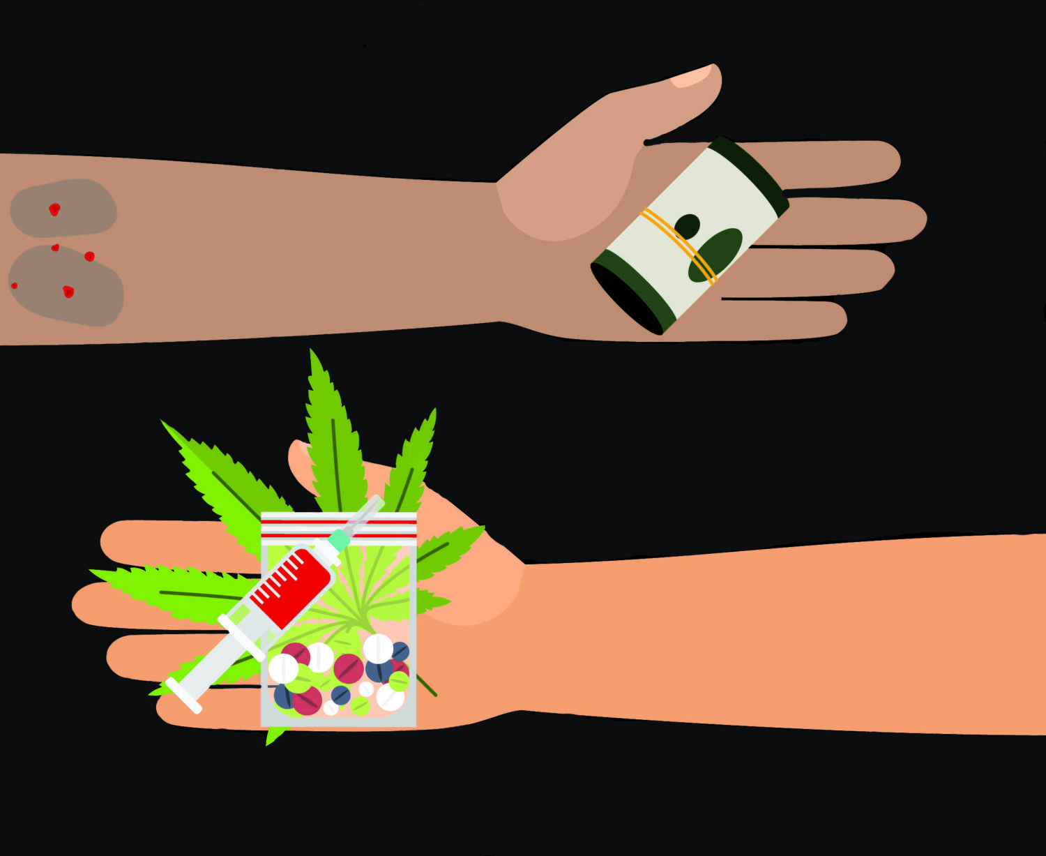
I chose this as my feature image, a photo I obtained via Adobe Stock images through my account:
The angle I decided to take overall was the how big the scale of the problem was and used the article as a way to expose the truth about the problem which was my intentions before I set out to start the piece.
03 May, 2018
I changed my mind and decided to edit the background of my feature image on photoshop to make it a little darker to suit the house-style of my blog.