29 Apr Website Screen Grabs – shaughnaphillips.co.uk
Shaughnaphillips.co.uk
I have recently set up my own website where I post articles on a number of different topics. These topics include news stories like my report on the recent taxi demo, sports stories like my coverage of the Hereford United liquidation case, and Fashion and beauty articles like my ‘top 5 beauty buys’ article.
I am very pleased with my website and the way I have built it using my Loma theme. Here are a few screen grabs of what I have achieved so far.
1. My front page along with my master slider. http://shaughnaphillips.co.uk
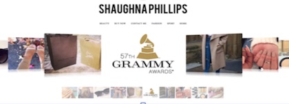
I worked very hard on creating a crisp, clean look to my front page. I liked the white background, as it wasn’t in danger of clashing with any pictures I upload. I uploaded my own font for my header ‘Shaughna Phillips’ which will take you back to my front page when you click on it. Underneath that you have links to all my active pages filled with content.
My master slider is one of my favourite parts of my website as it gives a real professional look as soon as you arrive. All the pictures are links to various stories when clicked on. For example, the ‘Grammy’ photo in the screen grab above will take you to my article on the recent Grammy awards, featuring my review on some of the outfits worn. The slider rotates every three seconds and viewers are also able to click on the pictures below the slider to take them direct to the story.
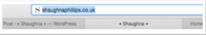
Another simple feature I added to my website was the ‘S’ icon that appears in the address bar. It is a small yet simple way to keep the black and white theme going throughout my whole website.
2. My Articles on my front page http://shaughnaphillips.co.uk

As you scroll down through my home page, the header becomes interactive and goes with the page. You also still have the option to click on the pages at the top, making it easier for the visitor to navigate around the page. I spent a lot of hours tediously making the feature images the same size on all of my articles in order to keep my home page looking neat and tidy, and not like a Google search. You have the option to filter the articles into whatever category you wish simply by clicking on the options above, that way you are scrolling for ages searching for a particular story.
3. Posts have same house style http://shaughnaphillips.co.uk/sport/hereford-united-a-club-in-crisis/


When I initially created my posts, they had the same image as was featured on the homepage, however they were extremely pixelated. I wanted my articles to look neat and professional when my visitors were browsing so I decided to change the way they were set out. I added an initial title and tag line above the article as you can see in the above screen grabs. I then had my main title directly above where my article starts. Both of these articles have featured images in the left hand corner underneath the stand first.
The lay out may vary depending on what article you look at, however the lay out with the title remains. For example, as you can see above they both feature small photos, as the images aren’t the main body of the story, however in my Grammy article, I have a master slider showing all the outfits featured in my article because that is the highlight of the story.
4. ‘Buy now’ page http://shaughnaphillips.co.uk/beauty/my-top-5-beauty-buys/

My ‘buy now’ page features all the products, clothes and beauty accessories I have mentioned in any of my articles. In this particular post, I have featured make up essentials that I have mentioned in my posts as well as on my Instagram, which can be found to the right of the article. My website is mentioned in my Instagram bio and I often post articles and reviews on there to create more traffic for my website.
All the products I feature are easily accessible for the average person and I also give personal reviews and tricks to help the viewers reading the article. All of the shops and stockists are hyperlinked into the relevant paragraph and all prices are shown in my post. This type of page was important for me to have on my website as I wanted to create a personal touch and not just be somewhere I post stories.
5. Use of multimedia platform http://shaughnaphillips.co.uk/sport/hereford-united-a-club-in-crisis/

My website features many multimedia stories, two of which are featured above, therefore it was important for me to create something that was easy for my viewers to navigate around. It was also important for it to be aesthetically pleasing and not let my overall house style down.
Originally, when posting my audio reports, it would come up with a pixelated feature picture and completely ruin the flow of the article. However I managed to convert that into a nice sized bar at the bottom that suited the theme of the website as well as giving it a much more professional feel. (Please note the youtube video in the bottom screen grab is not stretched out on the article page)